Bløm’s audience lived on social, not on a list it owns. The email experience changes that.
Bløm Mead + Cider is an Ann Arbor mead and cider company built on locally sourced ingredients and community. Our team strengthened its owned marketing by redesigning how customers discover, join, and engage with its email list.
Problem
Bløm relied on social media to reach customers, and its site gave people few reasons, and few chances, to join the email list.
Solution
A delayed pop-up and an embedded form capture sign-ups without interrupting browsing, then a three-email welcome series introduces the brand.
UX Designer & Researcher (Team Client-based Project)
FigmaMailchimpSept 2025 - Dec 2025Email & Web
five courses, one trip
Let’s Break My Process Down
Research
The research focused on understanding how users perceive email sign-ups and welcome emails, what motivates them to subscribe, and what causes them to disengage. We combined behavioral data, competitive research, quantitative feedback, and qualitative interviews to understand both what users were doing and why they were doing it. The findings were then synthesized through affinity mapping and translated directly into design recommendations.
Mailchimp Analytics Review
Analyzed click rates, impressions, subscriber growth trends, unsubscribe patterns, high-performing email topics, seasonal engagement shifts, and acquisition sources.
Bløm's Email List At A Glance
7.8%
Click Rate This Month
Off the 8% the previous few months held, with August running ahead of September
120 to 130
Impressions Per Email
6,840
Subscribers On The List
-2%
Subscribers, Past 30 Days
About 35 people left, most of them around September 23
+297%
Subscribers, Year Over Year
The list has grown almost fourfold since this point last year
+35.3%
Embedded Form Sign-Ups
The fastest-growing source, though Square has collected the most over time
What The Numbers Pointed To
- Product-led emails earned the highest click rates, including the return of the black currant mead.
- Impressions held around 120 to 130, with one spike on August 13 worth tracing back to the post behind it.
- Square has collected the most subscribers over time, but the embedded form is the source growing fastest, which made it worth designing for alongside the pop-up.
- The dip around September 23 was a single drop rather than a steady leak, so the year-over-year picture stayed strong.
Competitive Audit
Benchmarked B. Nektar, Grizzly Peak, Virtue Cider, and Schramm's Mead to compare email capture strategies, incentives, embedded forms, website tone, and UX patterns.
| Features / Criteria | B. Nektar | Grizzly Peak | Virtue Cider | Schramm's Mead |
|---|---|---|---|---|
| Email Sign-Up | B. NektarPartly: Limited / difficult to find | Grizzly PeakYes: Footer form | Virtue CiderYes: Newsletter banner | Schramm's MeadPartly: Special-offer login |
| Email Pop-Up | B. NektarNo: No email pop-up | Grizzly PeakNo: None | Virtue CiderNo: None | Schramm's MeadNo: None |
| Embedded Email Form | B. NektarNo: Not prominent | Grizzly PeakYes: Footer | Virtue CiderYes: Prominent newsletter section | Schramm's MeadNo: Not identified |
| Sign-Up Incentive | B. NektarNo: None identified | Grizzly PeakNo: None identified | Virtue CiderPartly: Cider Society benefits | Schramm's MeadPartly: Special offer |
| Non-Intrusive Experience | B. NektarYes: Minimal interruptions | Grizzly PeakYes: No pop-ups | Virtue CiderYes: Simple sign-up | Schramm's MeadYes: Minimal interruptions |
| Brand Consistency | B. NektarYes: Strong edgy identity | Grizzly PeakYes: Strong visual consistency | Virtue CiderYes: Strong farm-inspired identity | Schramm's MeadYes: Consistent black & white |
| Content Clarity | B. NektarYes: Concise & direct | Grizzly PeakYes: Easy to scan | Virtue CiderYes: Simple & user-friendly | Schramm's MeadPartly: More complex navigation |
| Clear Online Ordering | B. NektarYes: Strong purchase focus | Grizzly PeakYes: Clear ordering links | Virtue CiderYes: Clear ordering system | Schramm's MeadYes: Add-to-cart flow |
| Community / Events | B. NektarPartly: Limited | Grizzly PeakYes: Events highlighted | Virtue CiderYes: Cider Society | Schramm's MeadNo: Not identified |
| Overall Opportunity | B. NektarImprove email discoverability | Grizzly PeakStrong embedded-form reference | Virtue CiderStrong subscription visibility | Schramm's MeadSimplify email capture |
User Survey
Collected quantitative feedback about pop-up perception, incentives, welcome-email behavior, preferred content, and email cadence.
Who We Heard From
93%
Aged 18 To 25
76.1%
Shop On Mobile
71.7%
Shop On Desktop
56.5%
Shop Weekly Or More Often
Exposure To Email Sign-Ups
95.7%
Visited or bought from a retail website in the past three months
87%
Have seen an email sign-up or pop-up form
65.2%
Have interacted with a welcome email series
Incentives Drive Sign-Ups
How likely are you to subscribe if the website offers a discount or incentive in exchange for your email?
46 Responses
- Very Unlikely2.2%
- Unlikely19.6%
- Neutral28.3%
- Likely37%
- Very Likely13%
50% leaned likely or very likely to subscribe for a discount, against 21.8% leaning the other way. An incentive was the clearest lever we had for getting an address at all.
View As Table
| Answer | Responses | Share |
|---|---|---|
| Very Unlikely | 1 | 2.2% |
| Unlikely | 9 | 19.6% |
| Neutral | 13 | 28.3% |
| Likely | 17 | 37% |
| Very Likely | 6 | 13% |
What Makes People Close A Pop-Up
What is most likely to make you close a pop-up? (Select up to two)
46 Responses
Tone outranked timing. Pop-ups got closed for how they asked as often as for when they asked, so the wording mattered as much as the delay.
View As Table
| Answer | Responses | Share |
|---|---|---|
| The message feels pushy or guilt-trippy | 36 | 78.3% |
| It covers too much of the page | 28 | 60.9% |
| Too many fields to fill out | 26 | 56.5% |
| It appears too soon | 24 | 52.2% |
| No incentive | 1 | 2.2% |
| No benefits to me | 1 | 2.2% |
Welcome Emails Rarely Get Read
How likely are you to read through a welcome email?
46 Responses
- Very Unlikely23.9%
- Unlikely52.2%
- Neutral13%
- Likely8.7%
- Very Likely2.2%
76.1% leaned unlikely to read a welcome email at all, and only 10.9% leaned likely. The first email had to earn its opening in a line or two rather than assume attention.
View As Table
| Answer | Responses | Share |
|---|---|---|
| Very Unlikely | 11 | 23.9% |
| Unlikely | 24 | 52.2% |
| Neutral | 6 | 13% |
| Likely | 4 | 8.7% |
| Very Likely | 1 | 2.2% |
What People Want In A Welcome Email
What kind of content would be helpful to receive in a welcome email?
46 Responses
Deals and discounts were near-unanimous at 97.8%, while the brand story most welcome emails open with came last at 19.6%. The offer had to lead and the story had to follow it.
View As Table
| Answer | Responses | Share |
|---|---|---|
| Deals & discounts | 45 | 97.8% |
| Products | 21 | 45.7% |
| Events | 15 | 32.6% |
| Brand's story | 9 | 19.6% |
What Customers Want
The Offer First
97.8% named deals and discounts as the content worth receiving, ahead of products, events, and the brand story.
A Reason To Hand Over An Email
An incentive moved 50% toward subscribing. Without one, the ask reads as an interruption with nothing behind it.
Room To Browse First
52.2% close a pop-up that arrives too soon, so email capture had to follow the visit rather than open it.
One Field, Not Five
56.5% close pop-ups that ask for too much. An email address is the only thing worth asking for at that moment.
Three To Four Emails, Two Weeks
Short, clean, value-first messages with one clear call to action each, at a pace that does not wear out its welcome.
User Interviews & Affinity Mapping
Explored deeper motivations and emotions surrounding email sign-ups, including trust, value, tone, frequency, and common annoyance triggers.
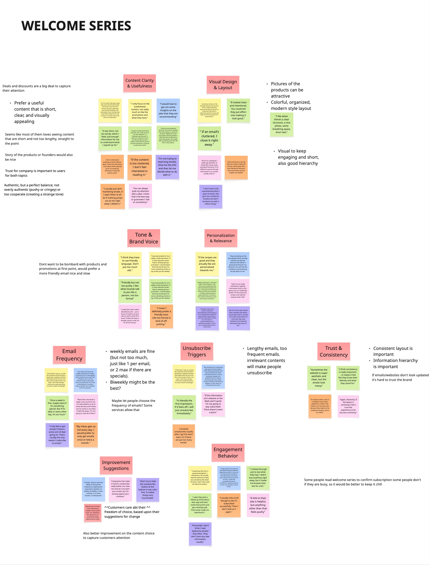
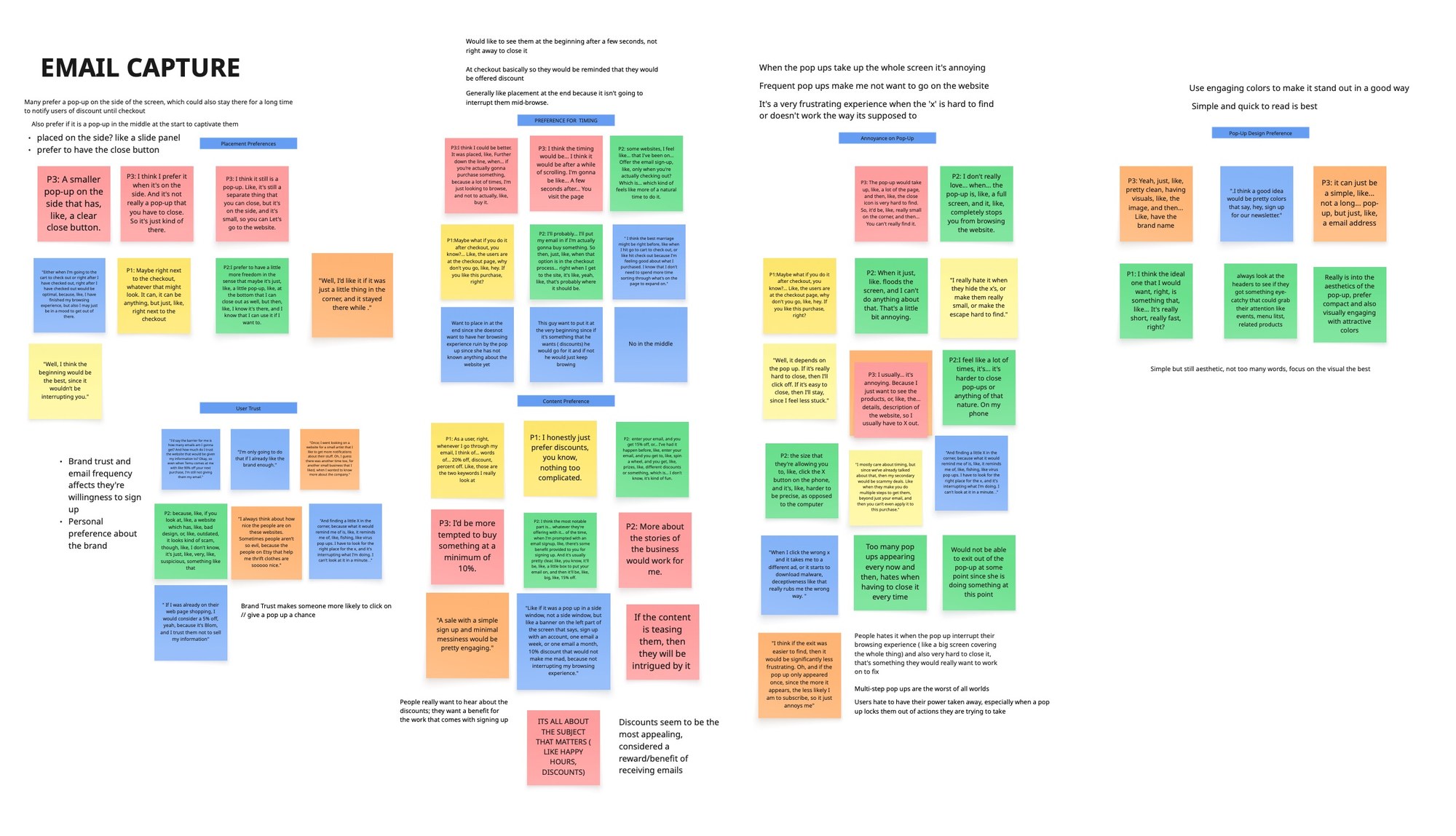
We then synthesized those findings into recurring themes around content clarity, visual design, brand voice, personalization, frequency, trust, pop-up timing, placement, and user frustration, mapping the email series and the pop-up separately.
Key Findings
Three findings shaped what the email onboarding experience had to get right.
Incentives Drive Sign-Ups
Discounts emerged as one of the strongest motivators for subscribing. Survey findings showed that users were more willing to provide their email when they received a clear, tangible benefit, while 97.8% identified deals and discounts as content they wanted to receive in welcome emails.
Timing & Intrusiveness Matter
Users strongly disliked email pop-ups that interrupted their browsing experience. 52.2% disliked pop-ups that appeared too soon, while other major frustrations included pushy messaging, oversized pop-ups, and forms requiring too many fields. This showed that email capture needed to happen at the right moment rather than immediately demanding attention.
Clarity, Control & Relevance Build Trust
Users preferred straightforward, useful emails over aggressive promotional messaging. They wanted concise content, clear visual hierarchy, friendly brand language, manageable frequency, and greater control over how often they heard from a brand. These findings showed that successful email onboarding was not simply about capturing an address, it was about respecting users' attention after they subscribed.
Design
The design focused on creating an email system that increases sign-ups and engagement without disrupting the user experience, while remaining consistent with Bløm's existing brand. Research findings shaped two primary areas of the experience: email capture and the welcome email series.
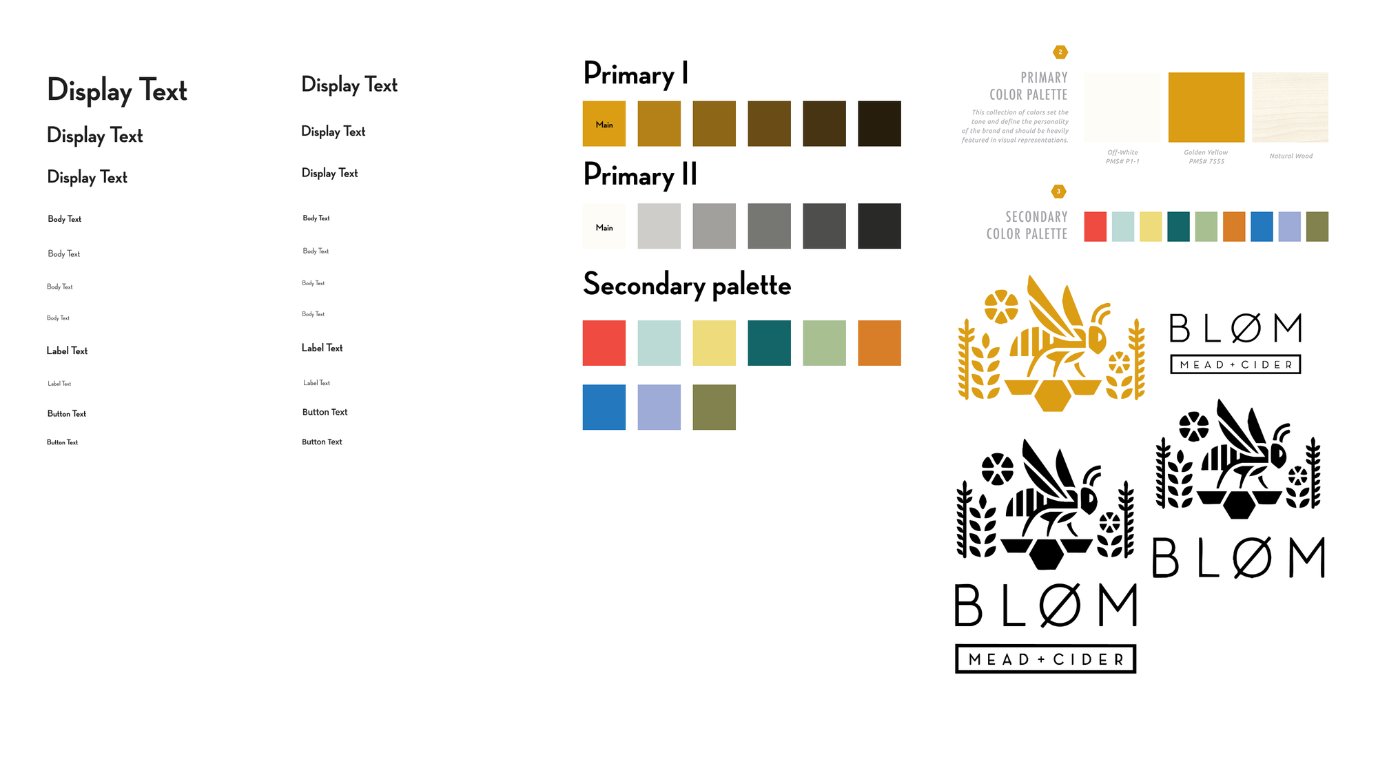
Create Design System
Built a reusable design system so every email capture and welcome-email screen draws from the same palette, type styles, and components.
Defining the system first meant imagery, offers, and events could be swapped without rebuilding a layout, and it kept the pop-up and the welcome series unmistakably Bløm across desktop and mobile.
Wireframes
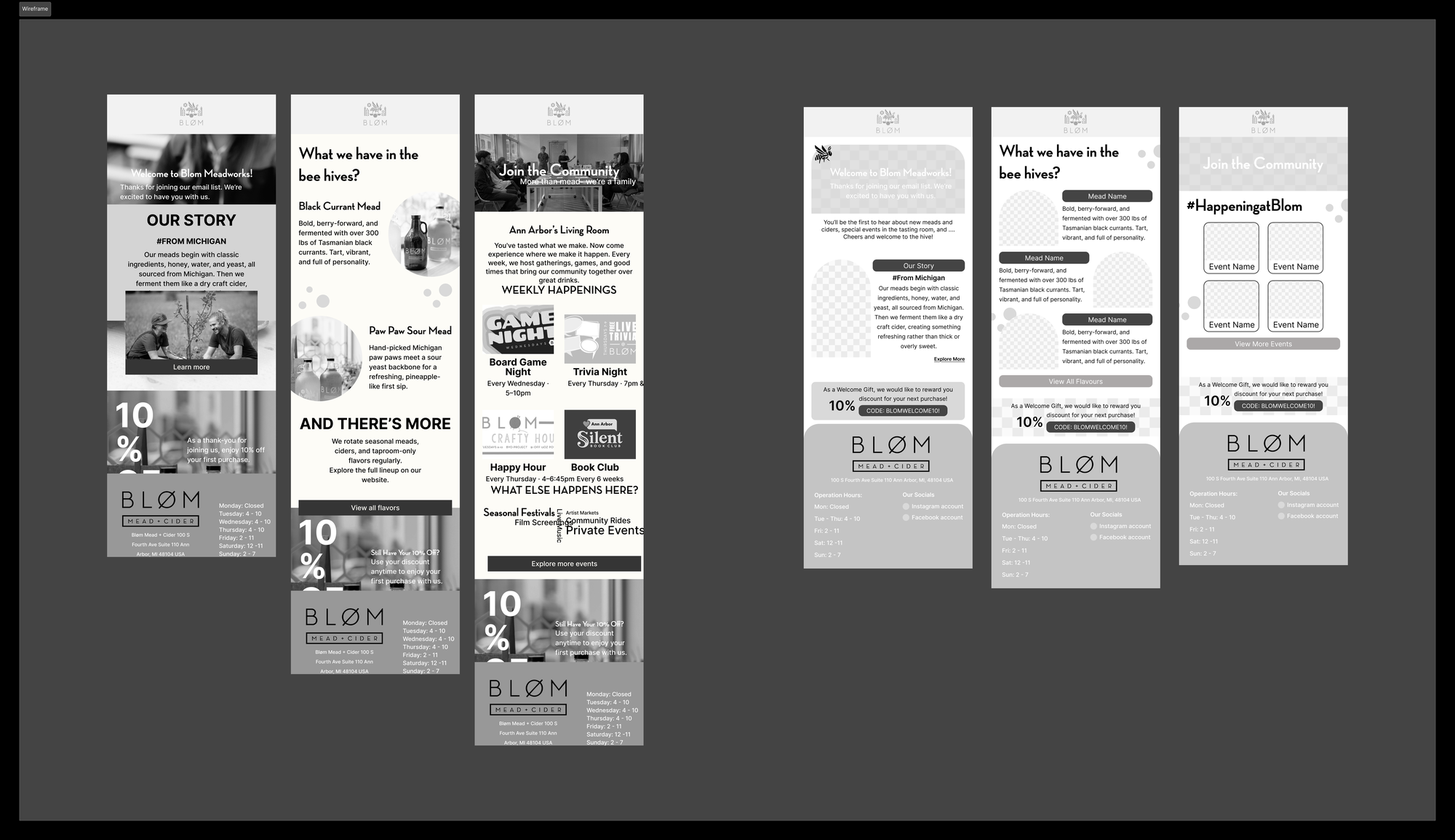
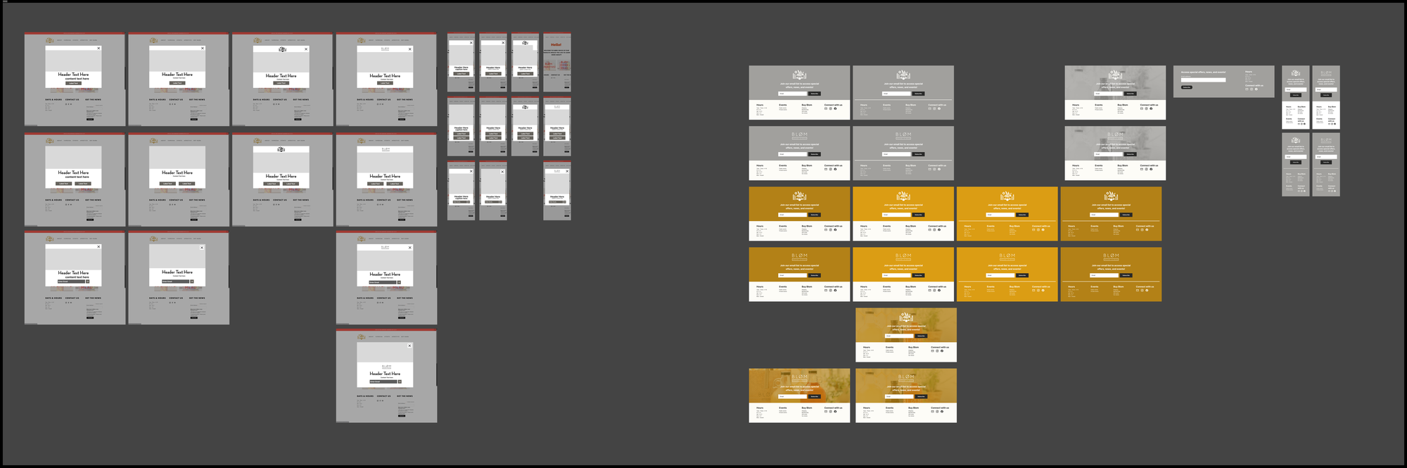
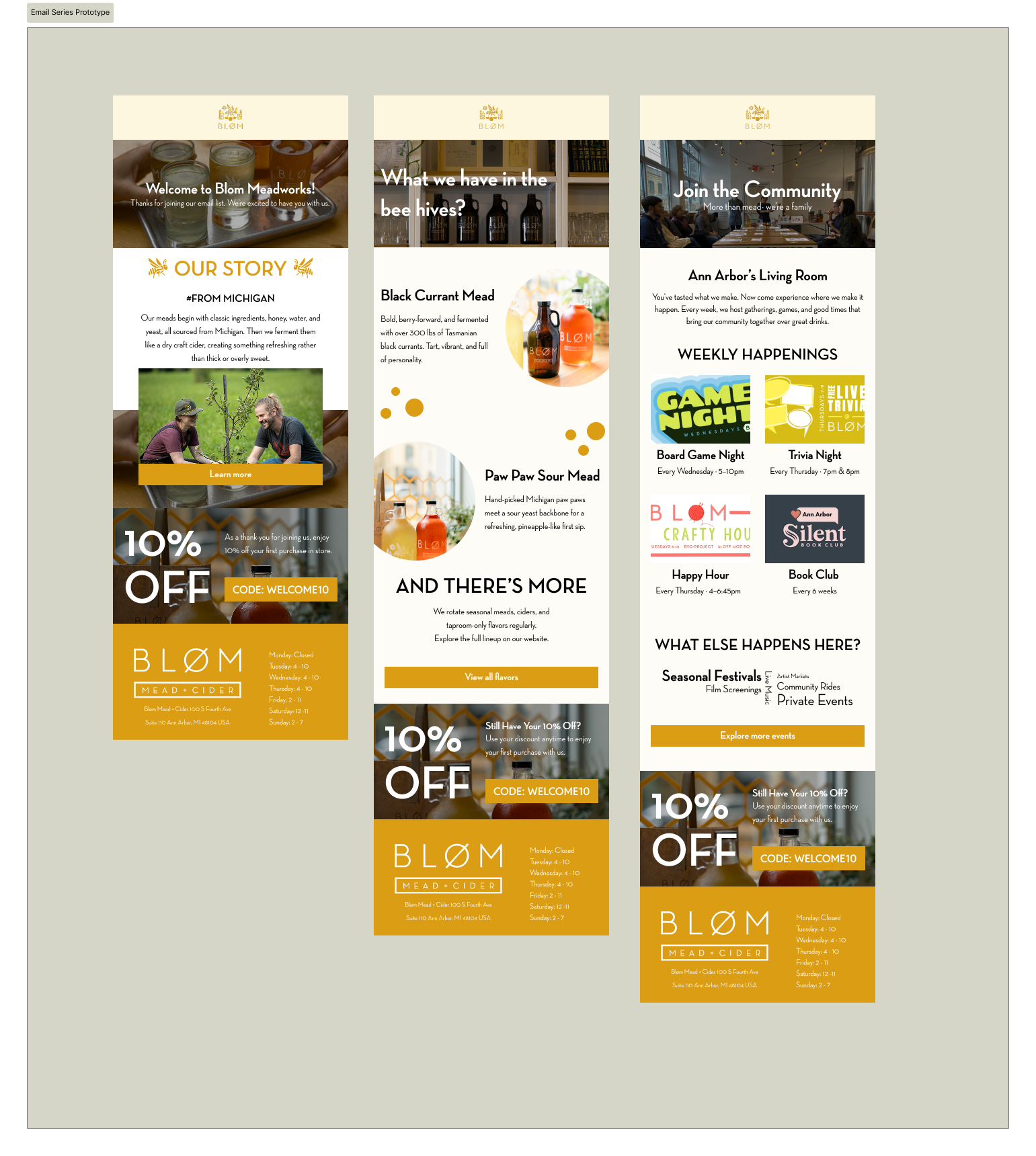
Wireframed both touchpoints before visual design: the three-email welcome series and the delayed email capture pop-up.
Working in low fidelity kept the focus on structure, so we could settle content order, form length, and where the embedded form sat on the site before committing to visuals.
Iteration & Refinement
Refined messaging, visual hierarchy, timing, content structure, and brand consistency based on research findings and team feedback.
Overall Design Phase
The hardest problem, the biggest win, and the decision that shaped the whole system.
Key challenge
Increasing email sign-ups without creating another disruptive marketing experience. Users wanted incentives, but they also strongly disliked intrusive pop-ups, aggressive messaging, and excessive email frequency.
Key accomplishment
Designed a complete email onboarding system consisting of a delayed email pop-up, persistent embedded form, and three-email welcome series that balances conversion goals with user trust and Bløm's brand identity.
Key design decision
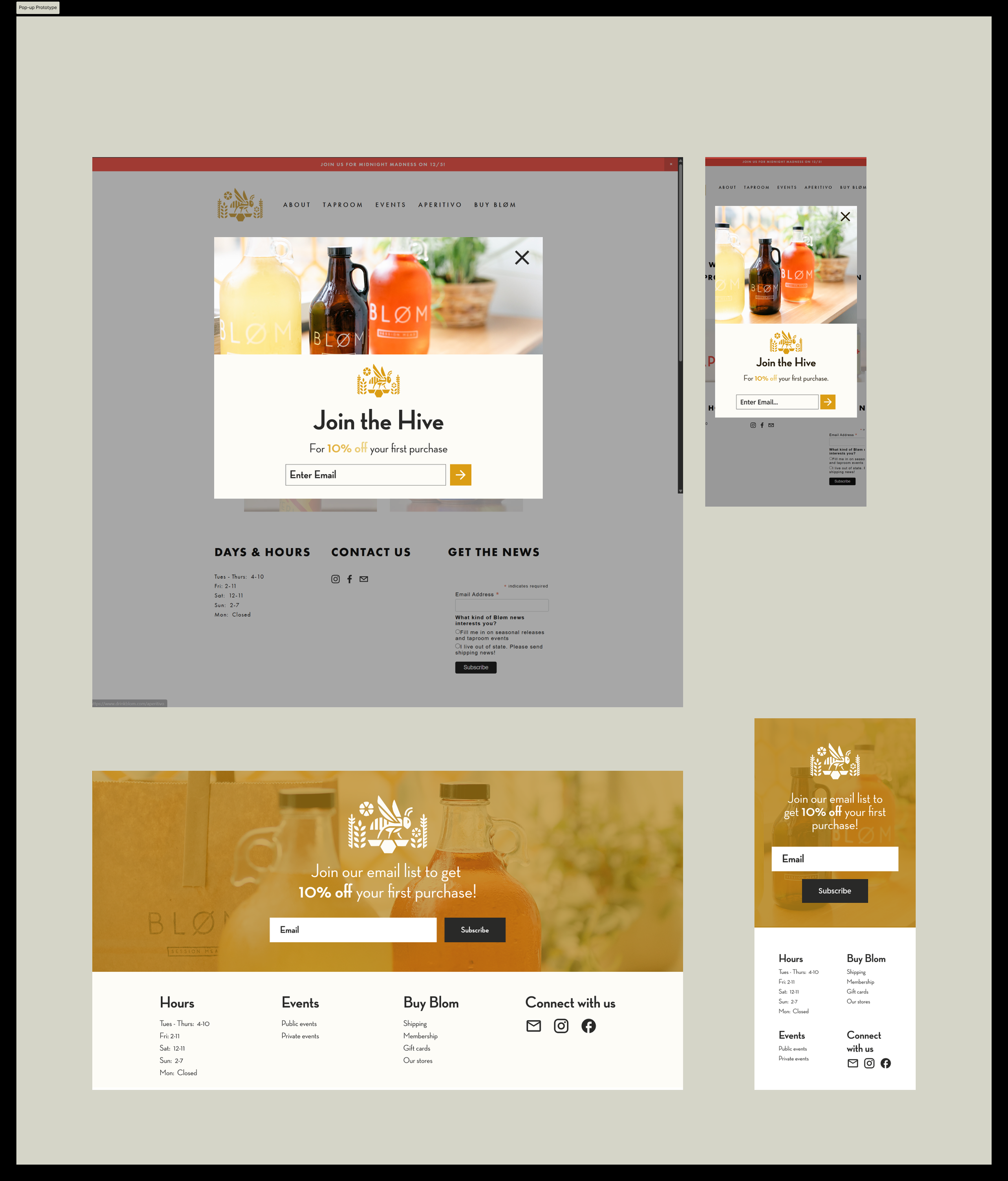
Instead of relying on one aggressive email capture moment, we created multiple opportunities for users to subscribe. The pop-up appears after 5 seconds of browsing, while the embedded form remains available at the bottom of the website for users who prefer to subscribe on their own terms.
Results
Key Contributions & Design Decisions
Delayed Email Pop-Up
Designed desktop and mobile pop-ups that appear after five seconds of browsing, giving users time to engage with the website before being prompted to subscribe.
Embedded Email Capture
Added a persistent embedded form near the bottom of the website, providing a lower-pressure alternative for users who prefer to subscribe on their own terms.
Clear Incentive Strategy
Introduced the message “Join the Hive for 10% off your first purchase”, making the value of subscribing immediately understandable.
Three-Email Welcome Series
Structured onboarding around three stages: Welcome & Thank You, Flavors & Offer Reminder, and Join the Community, moving users from brand trust to product awareness and eventually community connection.
Visual & Brand Consistency
Used Bløm's product photography, existing visual identity, concise content, and clear hierarchy to create a system that feels integrated with the broader brand rather than like generic marketing.
Sustainable Design System
Created reusable templates whose imagery, offers, event information, and content can be updated as Bløm's business priorities evolve without requiring the underlying design to be rebuilt.
Business Value
Implementation happens after handoff, so there is no post-launch performance data yet. What follows are the outcomes the research supports, rather than results already measured.
The redesigned system creates opportunities to improve three areas of Bløm's email funnel:
- More Subscribers: research indicated that incentives increase willingness to subscribe, supporting the decision to prominently feature a discount in the email capture experience.
- More Interaction: once subscribed, users showed interest beyond discounts, with 45.7% wanting product content and 32.6% wanting event content, informing the structure of the welcome series.
- More Retention: the system prioritizes concise content, manageable frequency, visual storytelling, and a friendly tone to build a longer-term relationship instead of overwhelming new subscribers immediately after sign-up.
Reflection
What I learn..
Three lessons from designing an email onboarding system for a client.
Conversion and User Experience Need to Work Together
Increasing email capture wasn't about showing users more pop-ups. Research showed that timing, tone, visual simplicity, and user control were just as important as the incentive itself.
Research Should Directly Shape Design Decisions
Findings such as users disliking immediate pop-ups, preferring discounts, and wanting concise visual emails translated directly into the delayed pop-up, 10% incentive, embedded form, and three-email welcome sequence.
Designing for the Client Means Designing Beyond Handoff
Creating reusable templates made the solution easier for Bløm to maintain, update, and adapt for future products, events, and campaigns without redesigning the entire system.