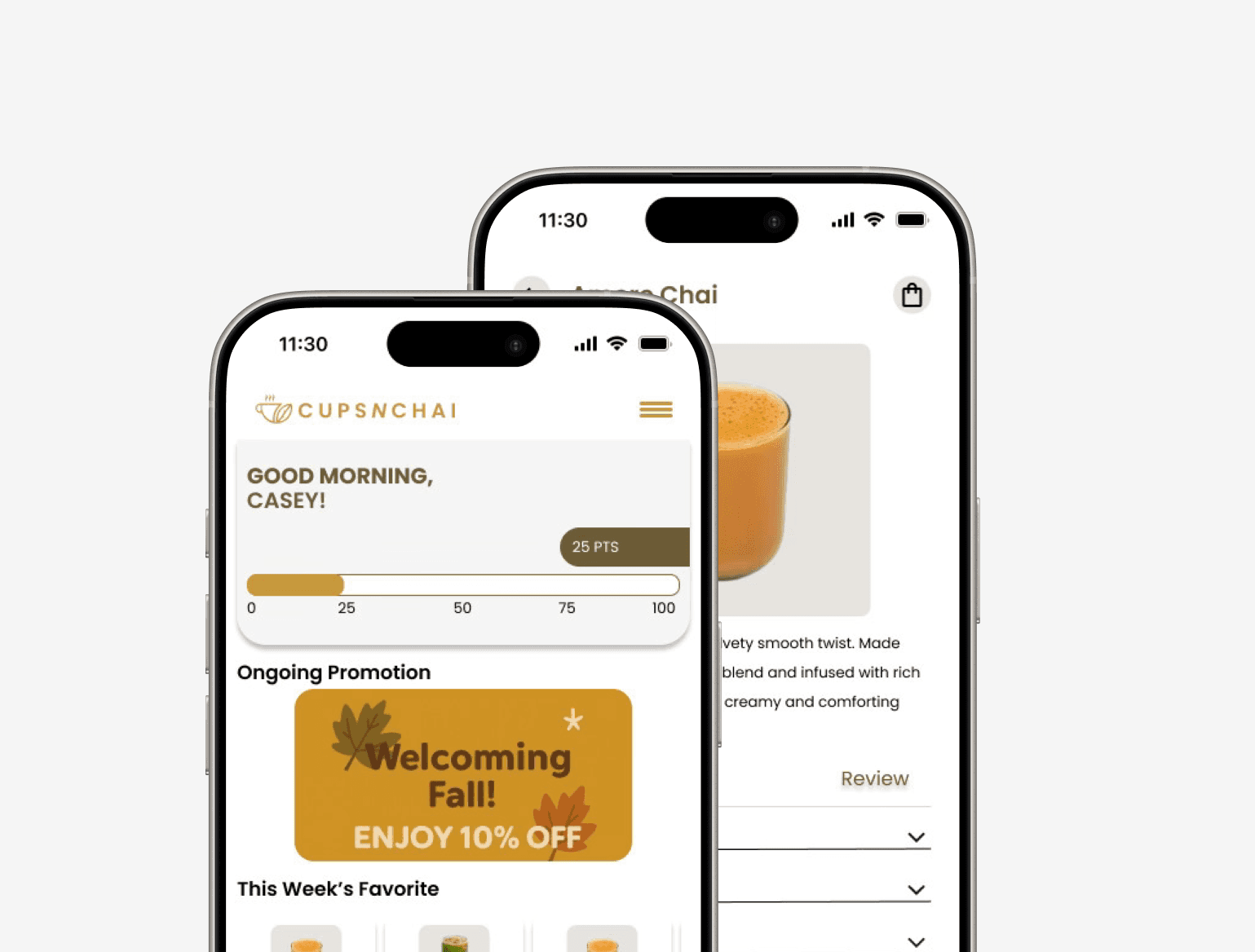
Regulars order the same chai every week and start over every time. The new app remembers them.
Cups N Chai is a South Asian café in Ann Arbor celebrated for its cultural comfort and warm hospitality. Its signature chai, street food, and desserts have made it a local favorite among students, families, and food lovers.
Problem
A third-party ordering system adds steps, blurs the brand, and leaves no room for loyalty or personalization in mobile ordering.
Solution
A custom ordering experience with quick reordering, loyalty rewards, and clearer navigation, owned end to end by the café.
UI/UX Designer (Individual)
FigmaUserTestingAug 2025 - Oct 2025Mobile Ordering
five courses, one trip
Let’s Break My Process Down
Research
The research highlighted a gap in Cups n Chai’s digital experience caused by reliance on a third-party ordering platform. Our findings underscored the need for a dedicated, branded ordering system with streamlined navigation, loyalty features, and personalized reordering to better serve repeat customers.
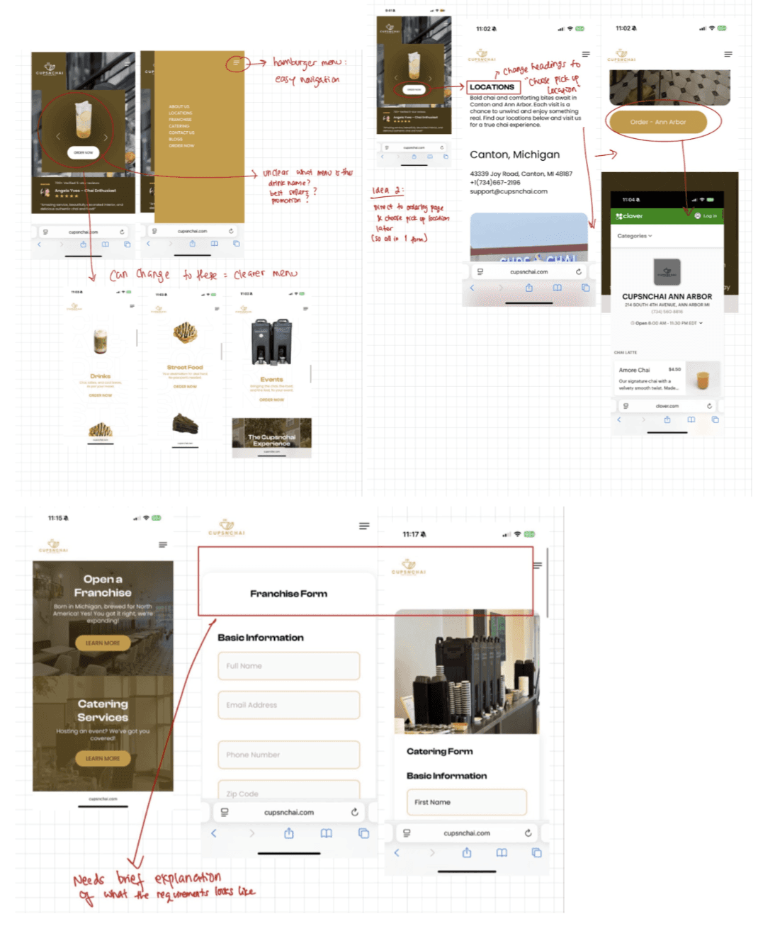
Heuristic Evaluation
To identify usability pain points in the current mobile flow.
Competitor Analysis
To benchmark against local cafés (Socotra Coffee House and RoosRoast Coffee) and uncover opportunities in loyalty, branding, and engagement.
| Features | Socotra Coffee House | RoosRoast Coffee | Cups N Chai |
|---|---|---|---|
| Cultural Identity / Storytelling | Socotra Coffee HouseYes: Highlights Yemeni culture | RoosRoast CoffeeNo: Less cultural emphasis, more quirky branding | Cups N ChaiYes: Strong South Asian identity |
| Loyalty Program / Rewards | Socotra Coffee HouseNo: None | RoosRoast CoffeeYes: Subscription + “Subscribe & Save” program | Cups N ChaiNo: None |
| Online Ordering Experience | Socotra Coffee HouseNo: No in-website ordering experience | RoosRoast CoffeeYes: Streamlined, strong e-commerce | Cups N ChaiNo: Relies on third-party system |
| Social Media Presence | Socotra Coffee HouseNo: Inconsistent, less creative (3K followers) | RoosRoast CoffeeYes: Strong branding, consistent content (16K+ followers) | Cups N ChaiYes: Active with promotions/events (6.5K followers) |
| Customer Ratings (Google) | Socotra Coffee HouseYes: 4.7 (565 reviews) | RoosRoast CoffeeYes: 4.7–4.8 (600–1K reviews) | Cups N ChaiYes: 4.9 (226 reviews) |
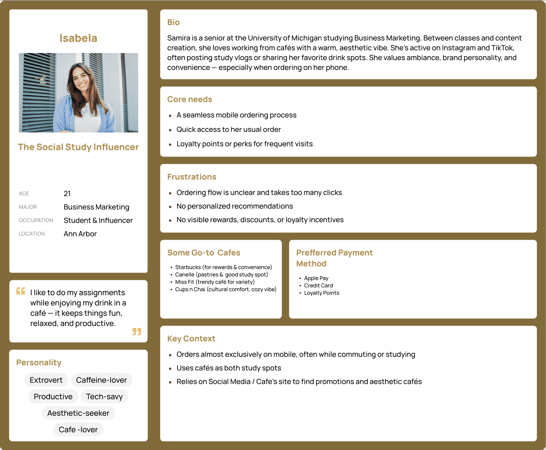
Persona Development
To capture the motivations and frustrations of core users like students and young professionals.
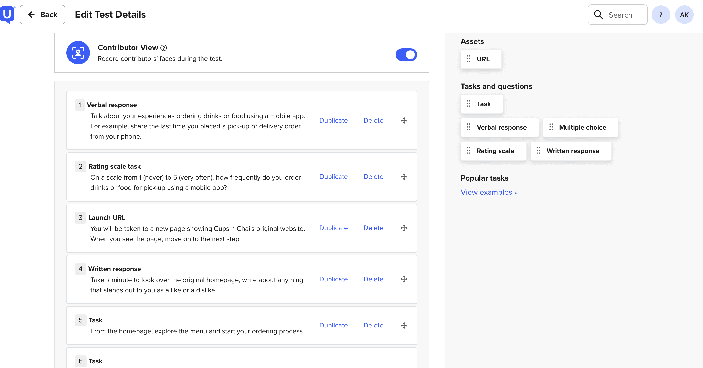
Usability Testing
To observe how target users interacted with the prototype, validating design decisions and uncovering friction points in navigation and ordering.
| Participants | Original Website | Prototype |
|---|---|---|
| P1 | Original WebsiteYes: Modern homepage, menu variety, easy to order ❌ Guest info required, limited payments, no sugar/ice options | PrototypeYes: User-friendly, easy navigation, clear payment, intuitive customization ❌ Confused by “Recent Orders,” suggested voice-order feature |
| P2 | Original WebsiteYes: Simple homepage, clear menu/prices ❌ Overloaded homepage, confusing customization, unclear hot/iced flow | PrototypeYes: Clear homescreen, built-in customization, better payment & tips ❌ Wanted ability to save customizations |
| P3 | Original WebsiteYes: Cute homepage, straightforward menu ❌ Pickup hard to find, poor flow, no customization options | PrototypeYes: Appealing colors, easy navigation, interactive customization ❌ Elements too small |
Key Findings
Three findings defined what a dedicated ordering system had to fix.
Ordering Flow Inefficiency
Heuristic evaluation and usability testings revealed friction in the ordering process: unclear “location” steps, missing built-in detailed customization (sugar/ice level), and extra effort for guest checkout. These issues slowed down ordering and frustrated repeat users
Loyalty & Competitive Edge
Competitive analysis showed that Socotra emphasized culture but lacked digital convenience, while RoosRoast offered strong loyalty and subscriptions. Cups n Chai currently has neither, leaving a gap in retaining repeat customers and competing effectively
User Needs & Expectations
The persona (Isabela, a student/influencer) and usability testing highlighted the demand for a seamless, mobile-first experience with clear navigation, rewards, and quick reordering. Users valued cultural ambiance but also expected modern app conveniences like personalization and efficient payments.
Design
The design concept centered around building a dedicated ordering system that simplifies the customer journey, introduces loyalty and personalization, and reflects Cups n Chai’s cultural identity.
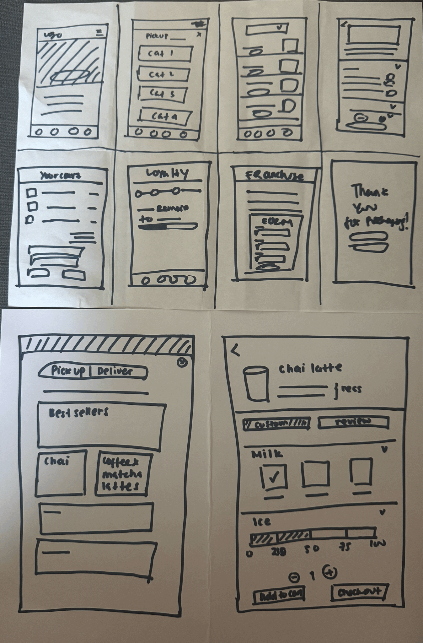
Sketching & Ideation
Explored layout concepts for homepage, menu flow, and loyalty features.
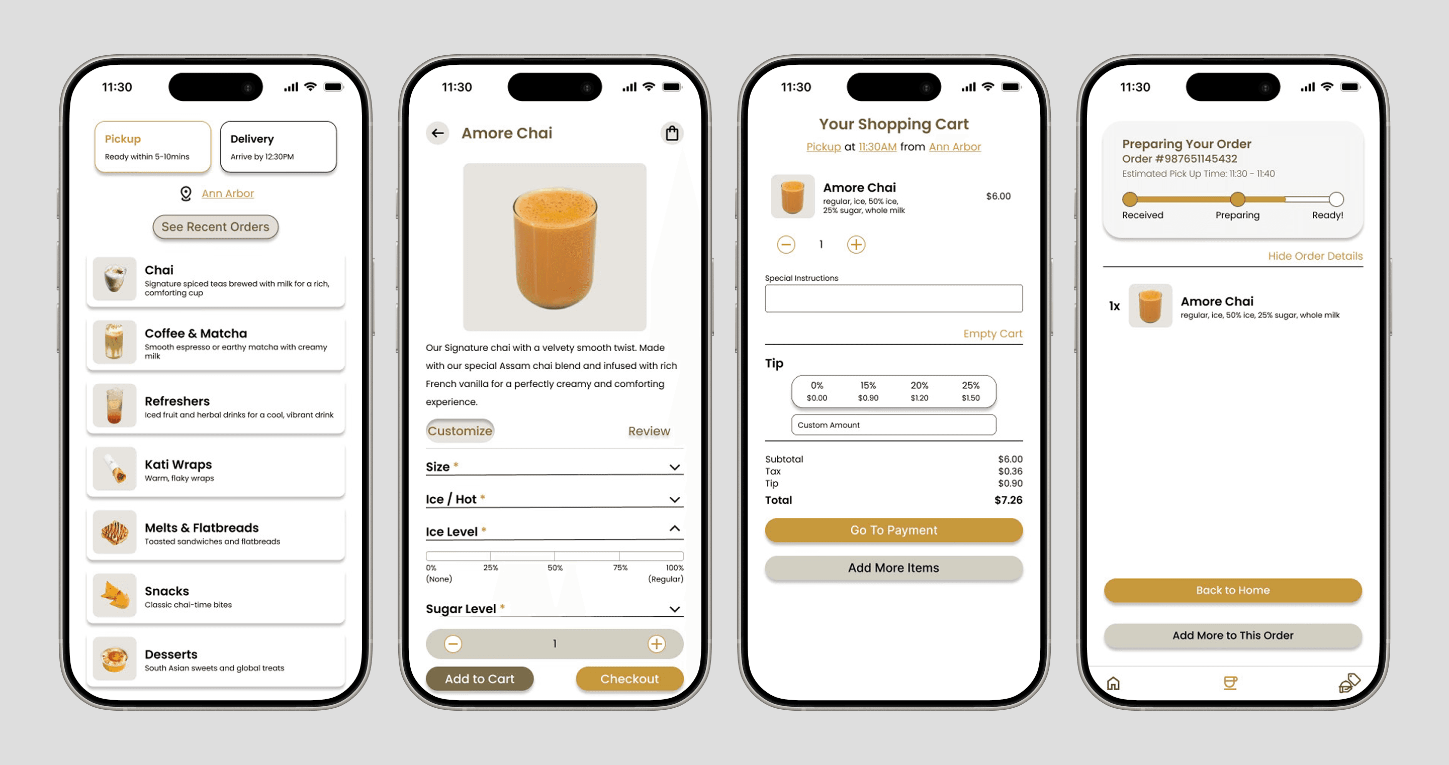
Prototyping
Built an interactive prototype to test ordering, customization, and rewards.
Accessibility Testing
Reviewed color contrast, typography, and touch targets to ensure compliance with WCAG standards and create an inclusive, user-friendly experience.
Usability Testing
Compared the prototype against the existing website, identifying improvements in navigation, customization, and payment flow.
Iteration & Refinement
Incorporated user feedback (e.g., saving custom orders, clearer “Recent Orders,” adjusting element sizes) to enhance clarity and usability.
Results
Key Contributions & Design Decisions
Dedicated Ordering System
Designed Cups n Chai’s first in-house ordering platform, replacing reliance on third-party tools and giving the brand full control over the customer journey.
Streamlined Ordering Flow
Reduced steps and clarified navigation, ensuring customers can access the menu and complete orders quickly with less friction.
Built-In Customization
Introduced interactive sugar/ice sliders, moving customization out of “special instructions” and into the UI for greater accuracy and user satisfaction.
Loyalty & Quick Reorder Features
Implemented concepts for loyalty rewards and saved orders, boosting retention and providing Cups n Chai with a competitive digital edge while reinforcing their cultural brand identity.
Reflection
What I learn..
Two lessons from designing a café’s first in-house ordering experience.
Convenience Drives Loyalty
Built-in customization and quick reordering features directly addressed pain points and encouraged repeat engagement.
Clarity Reduces Decision Friction
Clear navigation, simplified menu categories, and a straightforward drink customization process helped people quickly find what they wanted and feel confident ordering.