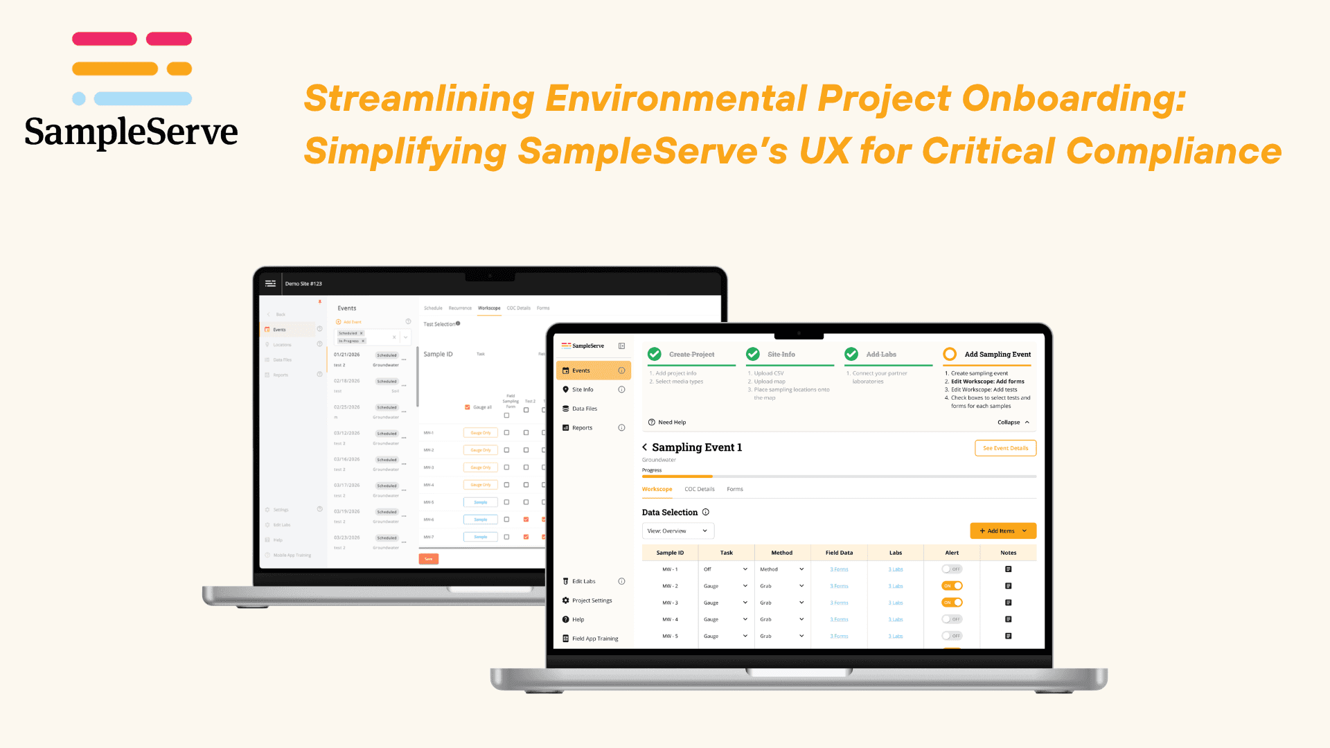
Setup asked new users to find their own way, so they called support. The redesign guides them through it.
SampleServe is a cloud-based environmental project management platform. Our capstone team redesigned the onboarding experience of its Project Management Tool so new users can complete setup independently, with less confusion and less reliance on support.
Problem
Unclear navigation and scattered guidance stopped new users from finishing project setup, so they leaned on videos, demos, and staff.
Solution
A guided setup flow with progress tracking, contextual help, and a dashboard-led structure that lets users finish onboarding on their own.
UX Designer & Researcher (Team Collaboration)
FigmaAug 2025 - May 2026Web Platform
five courses, one trip
Let’s Break My Process Down
User Research
To understand why users struggled with onboarding, our team conducted a mixed-methods UX research study combining both qualitative and quantitative approaches. We aimed to identify where users experienced friction, why onboarding completion rates were low, and how the platform could better support independent project setup.
FullStory Analysis
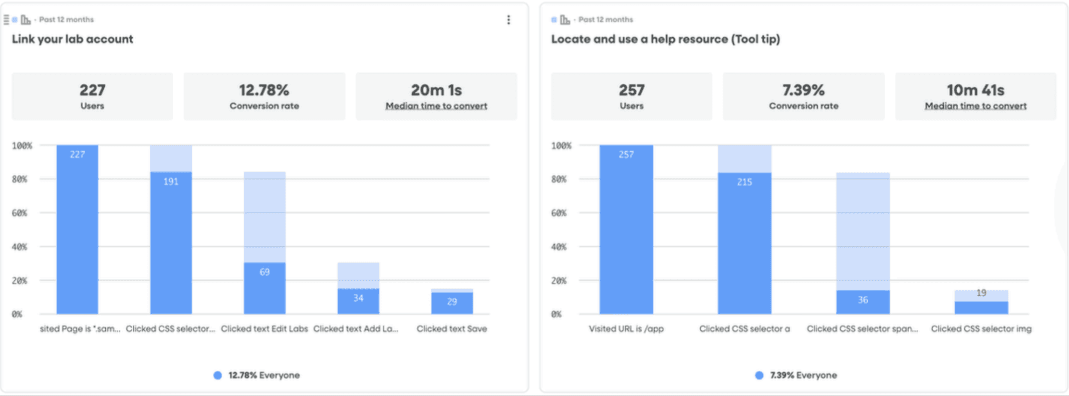
Analyzed 12 months of behavioral data from 268 users to identify drop-off points, frustration signals, completion rates, and onboarding bottlenecks.
- Only 3.4% of users completed onboarding end-to-end, indicating a major breakdown in self-service setup.
- ~76% drop-off occurred when users needed to locate core actions like “Add Project.”
- A 53-second pause to locate the “Add Event” button highlighted a visibility issue, not task difficulty, since 97% of users completed the action once found.
- 88% drop-off occurred in lab linking because the feature was hidden and poorly understood.
- Help features had very low engagement, around 5–15%, indicating poor discoverability and timing.
User Surveys
Collected feedback from current and recent SampleServe users to understand onboarding difficulty, support usage, technical proficiency, and platform perceptions.
- 8/10 users relied on external resources (videos, demos) and rated them as the most helpful resources.
- In-platform tooltips were used by only 40% of users.
- 60% of users previously relied on paper-based forms and adopted SampleServe to streamline project management and reduce manual work.
- Site map upload was rated as the most difficult onboarding step.
- Lab linking was never rated as “Very Easy,” indicating consistent friction.
- Users reported high technical proficiency, suggesting issues are design-related.
User Interviews
Conducted in-depth interviews with 3 users to uncover workflow challenges, support-seeking behaviors, mental models, and onboarding experiences.
- Onboarding is experienced as fragmented rather than guided.
- Users rely heavily on direct human support over built-in resources.
- Project setup is initially intuitive, but users lack guidance between steps.
- Workflows do not fully align with real-world user processes.
- Event setup is repetitive and manual.
Heuristic Evaluation
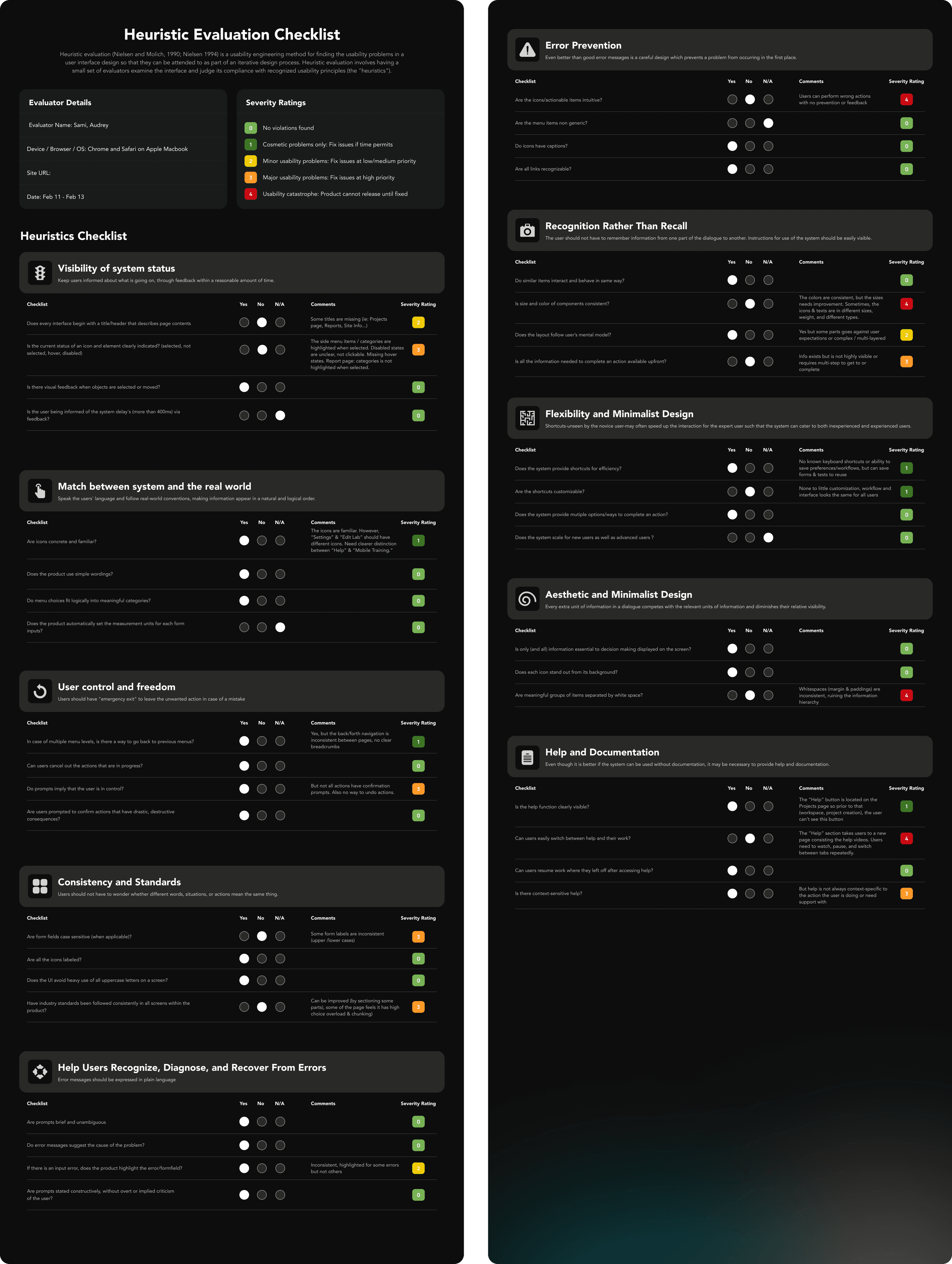
Evaluated the Project Management Tool using Nielsen’s 10 Usability Heuristics to identify violations related to navigation, visibility, consistency, guidance, and error prevention.
The heuristic review helped identify usability issues that contributed to confusion during onboarding, especially around visibility of actions, guidance between steps, and consistency across setup tasks.
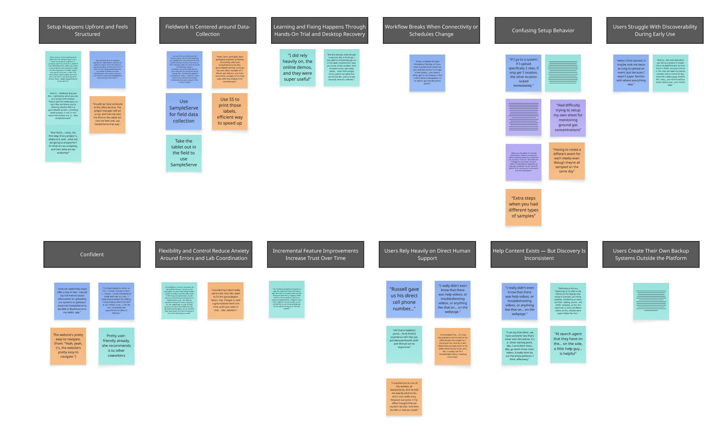
Affinity Mapping
Synthesized interview and survey data into themes to uncover recurring pain points, behavioral patterns, and opportunities for improvement.
This synthesis helped group findings into clearer themes such as support dependency, fragmented setup behavior, discoverability issues, and differences between intended and real user workflows.
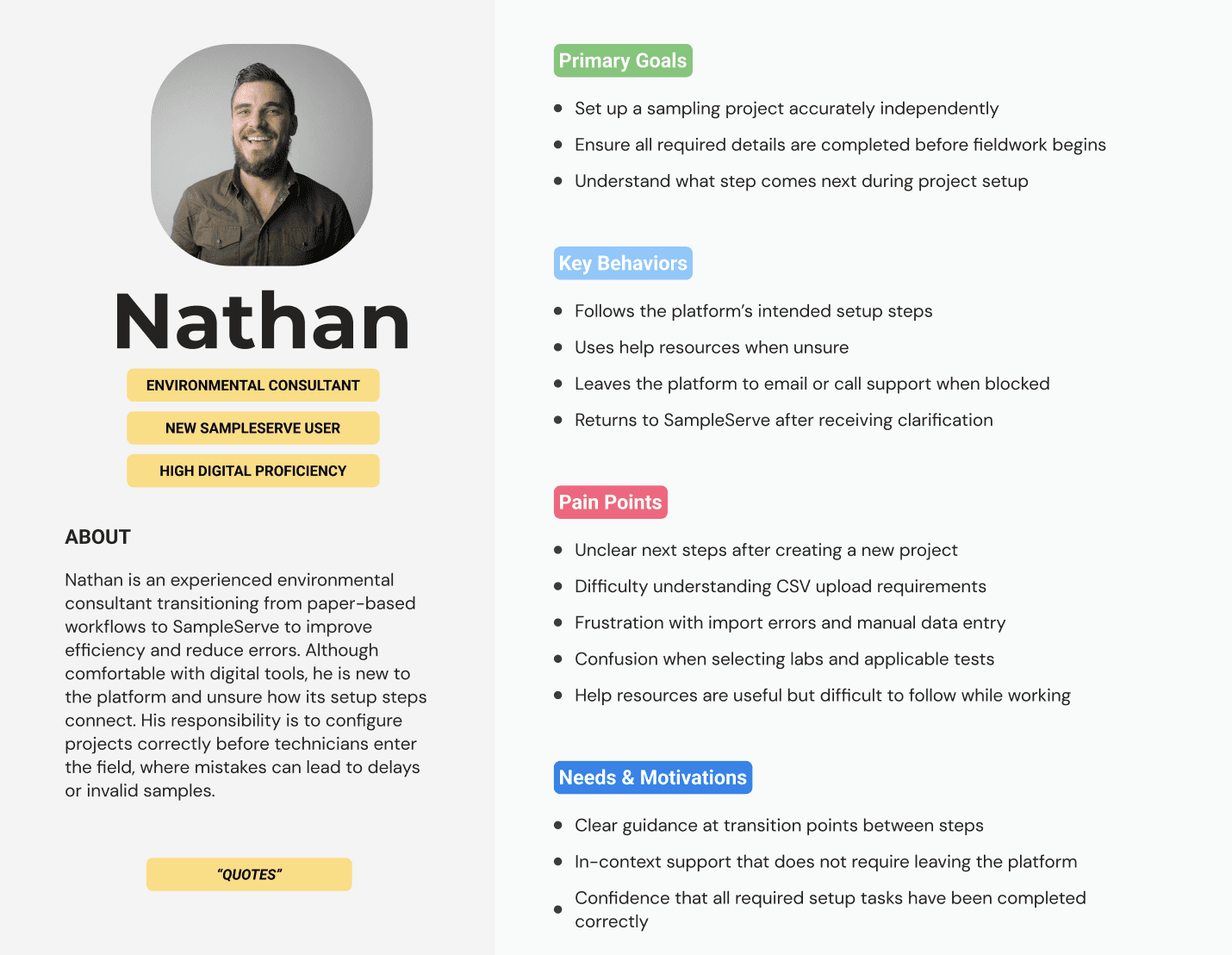
Persona Development
Created personas to capture onboarding behaviors, goals, and emotional pain points across new and returning users.
The personas clarified user goals and key behaviors, making it easier to see which parts of project setup needed more guidance and support.
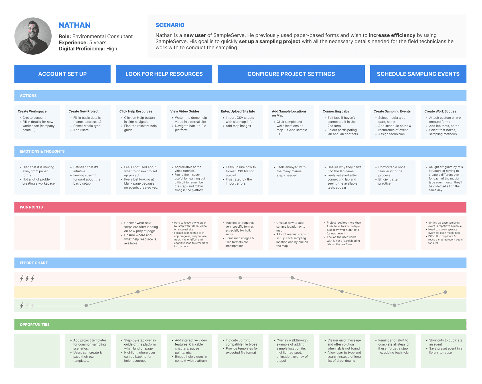
Journey Mapping
Mapped the onboarding journey to see where users lost momentum and how they felt at each stage of setup.
The journey map connected user actions to emotional highs and lows, exposing the moments where confusion turned into a support request.
User Flow Analysis
Mapped onboarding workflows to identify structural gaps, unclear transitions, and opportunities to create a more guided experience.
The flow analysis showed where users lost momentum between project initiation, site setup, lab linking, and execution planning, revealing the need for stronger structure and clearer next steps.

Priority Legend
Design Requirements Made as Design Phase Guidance
After completing the user research phase, we translated our findings into a structured set of UX requirements. These requirements connected what we learned from users to the design decisions we made later, ensuring that each redesign choice addressed a specific onboarding challenge.
Must Have
Required for users to successfully complete onboarding or access core functionality. Without these, the onboarding experience would fail or exclude users.
Should Have
Strongly improves usability, clarity, and error prevention, but is not strictly required for task completion.
May Have
Enhances the overall experience or efficiency but is not essential to onboarding success and can be deprioritized if needed.
| Themes | Requirements | Priority |
|---|---|---|
| Onboarding & Project Setup Navigation | Requirements1. The workspace must clearly communicate the user’s current onboarding state, completed setup tasks, and remaining required tasks. 2. The onboarding process must follow a structured sequence in which required setup tasks are presented in an order that reflects real-world project configuration dependencies. 3. The transitions between onboarding steps should feel predictable and manageable to prevent users from feeling lost. 4. Users should receive clear signals that the required setup tasks are complete before moving forward. | PriorityMust Have |
| Aesthetic & Visual Hierarchy Requirements | Requirements5. The system should follow SampleServe’s established design style guide, including logos, icons, fonts, and color palettes. 6. The interface must meet WCAG 2.1 Level AA accessibility standards to ensure usability for a wide range of users. 7. The system should maintain a clear visual hierarchy to distinguish primary actions from secondary information. 8. The interface should maintain visual clarity to reduce cognitive load during onboarding. | PriorityShould Have Must Have Should Have |
| Guidance & Help Resource Requirements | Requirements9. Users should be able to access guidance without leaving or interrupting their onboarding workflow. 10. Support and guidance tools should be contextually aligned with users’ current tasks to promote independent problem-solving. 11. The onboarding experience should reduce users’ reliance on external or manual assistance. | PriorityMust Have Should Have May Have |
Key Findings
Three themes explained why users could not complete onboarding on their own.
Key Actions Were Hard to Discover
Users were capable of completing tasks, but often struggled to locate important actions like Add Project, Add Event, and Lab Linking. This showed that the main issue was feature discoverability, not user ability.
Users Relied Too Much on External Support
Many users depended on videos, demos, and direct staff help instead of in-platform guidance. This revealed that SampleServe’s support system was not visible, timely, or contextual enough.
Onboarding Lacked Clear Structure
Users often became confused after completing one step because the platform did not clearly show what to do next. Missing progress indicators, weak transitions, and limited feedback made onboarding feel fragmented.
Design
The design focused on creating a guided onboarding experience that helps SampleServe users navigate complex project setup workflows with greater clarity, confidence, and independence through simplified navigation, progress tracking, contextual guidance, and clearer visual hierarchy.
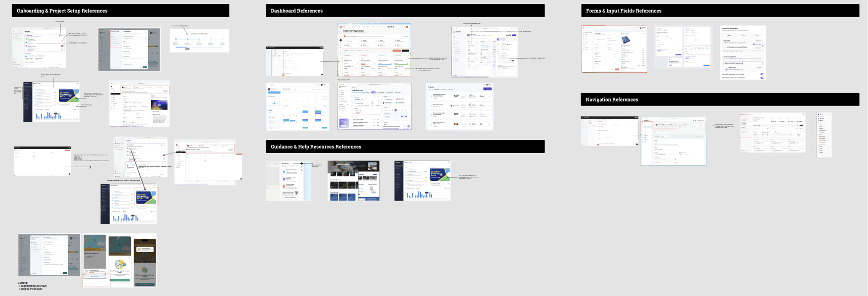
Ideation & Sketching
Explored layout, navigation, onboarding, and dashboard concepts.
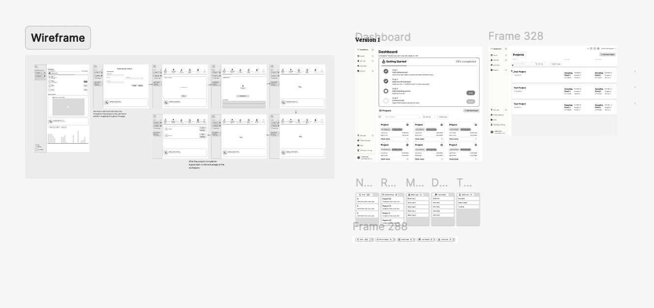
Low/Mid-Fidelity Wireframes
Created early flows for project setup, lab linking, site information, and event creation.
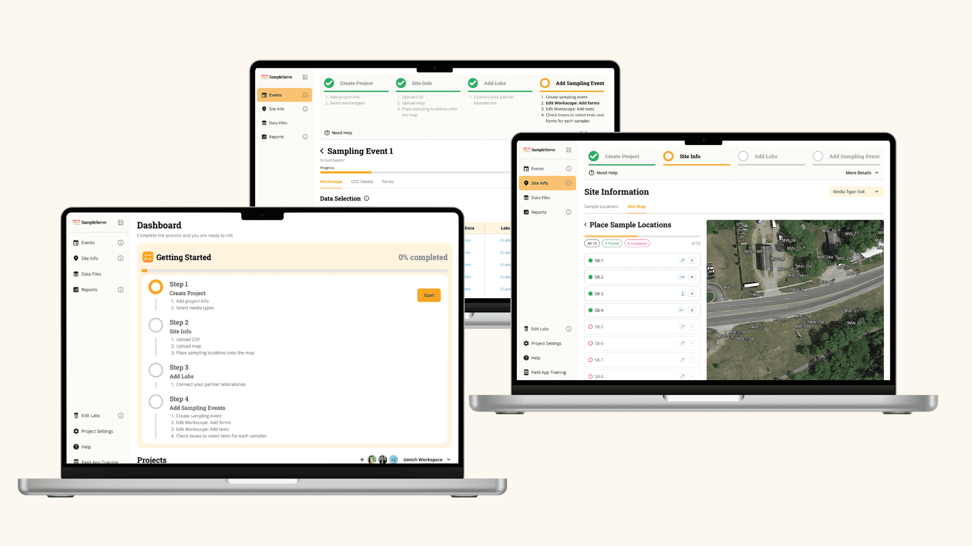
High-Fidelity Prototyping
Designed the guided onboarding experience in Figma.
Iterative User Testing
Tested task clarity, navigation, and user confidence across core workflows.
Iteration & Refinement
Improved labels, hierarchy, progress tracking, and contextual guidance based on feedback.
Overall Design Phase
The hardest problem, the biggest win, and the change that came directly out of testing.
Key challenge
Simplifying a complex environmental project setup workflow without removing the technical steps users needed for compliance, lab coordination, and field sampling.
Key accomplishment
Designed a guided onboarding system with simplified navigation, progress tracking, contextual help, and clearer page structures so users could complete project setup more independently.
Key iteration from feedback
After usability testing, we refined labels, strengthened visual hierarchy, added clearer progress indicators, and made key actions like project creation, lab linking, and site setup easier to find.
Results
Key Contributions & Design Decisions
Simplified Navigation & Information Architecture
Combined the multi-layered menus into one consistent sidebar and reorganized pages so users could better understand where they were and what to do next.
Guided Onboarding & Progress Tracking
Designed a “Getting Started” checklist, progress bar, and contextual pop-ups to guide users through setup and reduce reliance on external support.
Core Workflow Redesigns
Redesigned high-friction flows including project creation, lab linking, site information, map setup, and sampling events with clearer hierarchy, fewer steps, and more visible actions.
Impact
To validate the redesign, we conducted moderated usability testing with 7 participants, comparing key onboarding workflows between the existing platform and the redesigned prototype.
We collected qualitative feedback through think-aloud sessions, observations, moderator follow-up questions, and post-test reflections. These insights were then synthesized and translated into quantitative impact metrics, including task completion rates, error rates, moderator interventions, ease ratings (SEQ), and System Usability Scale (SUS) scores, allowing us to measure the effectiveness of the redesign.
| Task | Before Redesign | After Redesign |
|---|---|---|
| Task 1 | 0.8 | 0 |
| Task 2 | 1.4 | 0.4 |
| Task 3 | 0.6 | 0.6 |
| Task 4 | 1.8 | 0.4 |
53%
Less Assistance Needed
Users can now complete onboarding independently.
| Task | Before Redesign | After Redesign |
|---|---|---|
| Task 1 | 0.4 | 0 |
| Task 2 | 3.4 | 1.3 |
| Task 3 | 2.2 | 1.3 |
| Task 4 | 5.8 | 1.4 |
62%
Reduction in User Errors
Users can complete workflows more smoothly and confidently.
77
SUS Score
SUS Score Exceeded Industry Benchmark (68+)
Indicating strong overall usability and user confidence.
Reflection
What I learn..
Three lessons from redesigning onboarding for a complex enterprise workflow.
Guidance Matters Most
Users could complete tasks, but needed clearer next steps and better visibility.
Complex Workflows Need Structure
Enterprise tools work better when information is organized into clear, manageable steps.
Small Design Changes Can Have Big Impact
Clearer navigation, progress tracking, and contextual help reduced confusion and errors.